This week in EXSM 3989 we learned about the power of visual storytelling, and let me tell you, people in the fields of science and heritage have been doing this data sharing thing wrong for a very long time!
I wish that instead of teaching students how to calculate the radiocarbon date of organic material from the Holocene/Pleistocene transition in ARKY 101 I had taught them how to illustrate and visually express archaeological findings to ensure people outside of the field of heritage understand WTF they were saying and as a result, actually CARED…
It is really no wonder academics go nuts over a pretty map or a visually entertaining power point presentation when attending a talk that is more boring than watching paint dry. In fact, I am no longer shocked that people do not care about or read articles in the newspaper about the newest archaeological find, or why archaeological science and protecting heritage matters. It’s sad but if we cannot learn to communicate with others about why what we do actually matters, then maybe we too should go the way of the Pleistocene/Early Holocene Megafauna … (become extinct).
Archaeology, science and heritage need to start thinking about the visuals rather than the words! Visuals are processed 60,000 times faster than text and as Impact Advisors.com notes,
” if a scientific claim is presented in pure words or numbers, 68% of people will believe that the information is accurate and truthful. But if you put a simple graph with the claim, the number rises to 97%.”
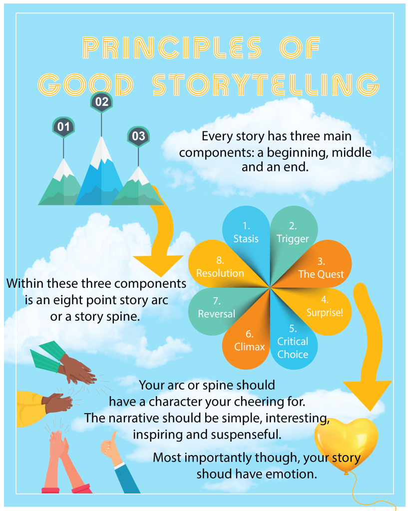
So when we were tasked this week to make an infographic on a topic we had learned about in the course (I chose the ‘Principles of Storytelling’), I WAS SUPER PUMPED! I wanted to learn this amazing skill! I wanted to visually seduce everyone into loving boring ass archaeology data by learning first how to do it by telling people how to write a good story! I felt like this was my new calling in life and I was going to blow everyone away!
But then my mother and father in law showed up a day early to our house as a surprise … so instead of knocking this assignment out of the park, I focused on the visuals, made the infographic pretty, bright and colorful. I focused less on mining the data to highlight the core principles of good story telling and rather, I took the key points I wrote down and used what I thought was the core principles and summarized them.
I hope you all enjoy it, but I know it could be better!
Please note: My mother and father in law have now returned to their own home and I am back, better and more focused than ever on becoming AMAZING at using visual data to tell stories rather than using words!
