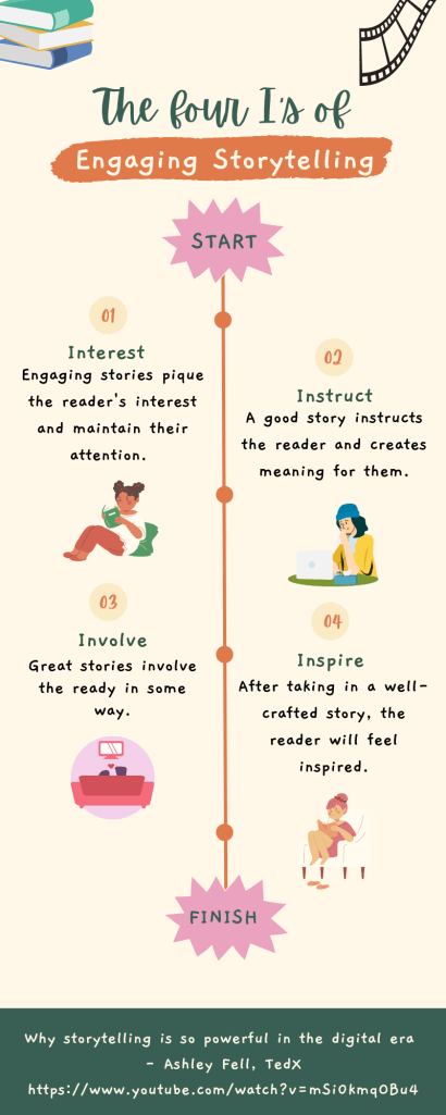
In Ashley Fell’s TED talk, called “Why storytelling is so powerful in the digital era,” she mentions the Four I’s of Engaging Storytelling. Essentially, these are four elements any story must have to engage the reader.
The Four I’s of Engaging Stoytelling
Interest. Engaging stories pique the reader’s interest and maintain their attention.
Instruct. A good story instructs the reader and creates meaning for them.
Involve. Great stories involved the reader in some way.
Inspire. After taking in a well-crafted story, the reader will feel inspired.
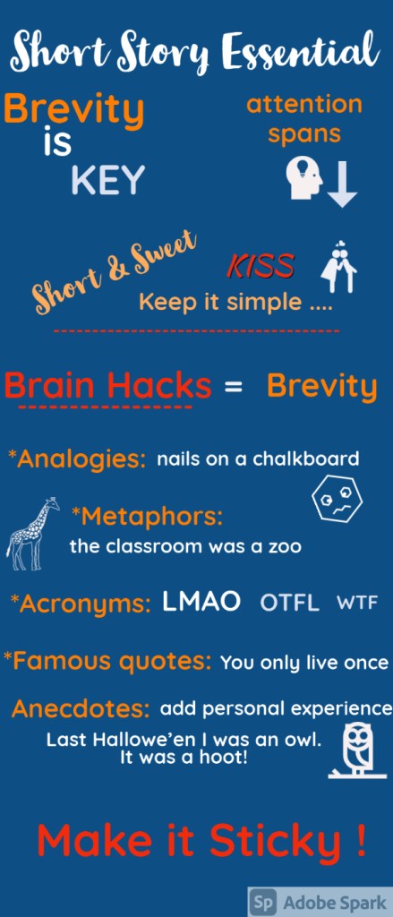
Brevity is essential to short form storytelling. Here are some tools to reduce your word count and still get your message across. It’s all about keeping it short, simple and “sticky”.
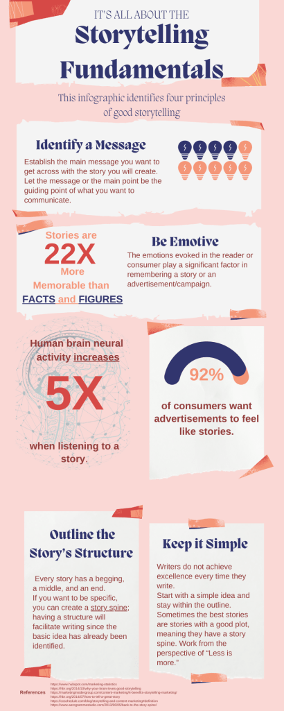
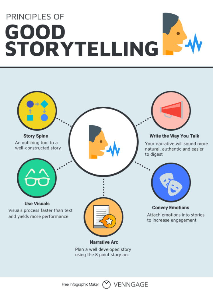
Writing a story, regardless of the field, can be nerve-wracking. There are so many elements to consider and developing an idea at times seems daunting. I created an infographic that identifies 4 principles of storytelling. The fundamentals address how to navigate the “prep” before storytelling takes place. Additionally, I included some statistics about storytelling and its relevance. For example, people’s neural activity increases when listening to a story; moreover, most consumers prefer advertisements that resemble stories. I invite you to take a look.
The ideas that I mention in the infographic can also be found below, where I develop the ideas even further.
Identify a message– Establish the main message you want to get across with the story you will create. Let the message or the main point be the guiding point of what you want to communicate. This is a fundamental concept that can be adapted into many fields, from marketing to literature.
Be emotive– Stories are 22 times more memorable than facts and figures; consequently, the emotions evoked in the reader or consumer play a significant factor in remembering a story or an advertisement/campaign. Writing the story from life experiences or considering the power of emotions can help to pull in the reader/consumer’s attention. The goal is to cause feeling.
Outline the story’s structure– Writing is a subjective experience. For some people, it comes easily; for others, it can be more challenging. Sometimes writers also face the loathsome ‘writer’s block.’ Create an outline can help you keep on track and get started. Every story has a begging, a middle, and an end. If you want to be specific, you can create a story spine ; having a stricture will facilitate writing since the basic idea has already been identified. Side note: creating an outline also helps task-oriented people.
Keep it simple– While it is understandable that you want to write the most fantastic story ever, sometimes writers do not achieve that excellence every time they write. Start with a simple idea and stay within the outline. Sometimes the best stories are stories with a good plot, meaning they have a story spine. Work from the perspective of “Less is more.”
I hope this short entry helps you “get going” in your writing or storytelling process. I am confident that these steps will help you write a great piece. Thanks for reading!
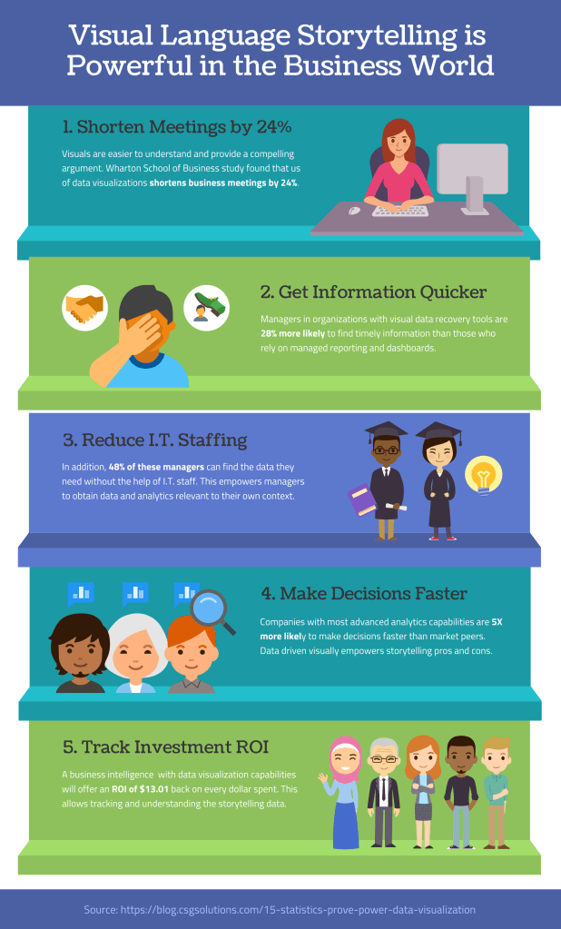
The story arc for my infographic is based on a blog about data visualization tools. My infographic shows how businesses are empowered through data storytelling to grow revenues and concurrently reduce their investments of time, human resources, and dollars in operational processes.
The first step, or beginning, is to use visual data storytelling to free up staff hours by reducing time in meetings because the visuals are more quickly understood (1). The middle of the story arc is empowering managers to get real-time information directly through visual language driven platforms (2); this will reduce I.T. time on manually sourcing lagging data (3); management will be empowered with confidence of real-time data to make decisions faster (4). At the end, investment in tools for data visualization storytelling to inform business operations will have a positive return on investment (ROI) by a trackable dollar amount of reduced overhead (5).
Takeaways
One of my biggest takeaways is the importance of playing to our brain’s strengths so to speak. Not only does the human brain process visuals 60,000 times faster than it does text, but 90% of the information that is transmitted to the brain is visual. For all types of education or information transmission, whether in the business or personal context, we should first think about how we can use visual storytelling. And of course, the most effective solutions will involve digital. As we move forward, the opportunities for digital storytelling will be unlimited.
Good data storytelling isn’t just piecing together a few charts and numbers, it requires several ingredients, according to Katy French. Through data storytelling, you can make better decisions, create effective content that connects with the right people, and improve your content marketing operation overall.
The right ingredients
I’ve always been fascinated by those who could present data and numbers in an appealing, compelling, and easy to understand manner. As French explains in her article “Why Data Storytelling is Marketing Gold for Your Brand,” the “ingredient” list to achieving good data storytelling, and as my infographic portrays, must include:
Good data
Synthesis
Narrative
Data visualization
Numbers have an important story to tell. They rely on your to give them a clear and convincing voice.”
Stephen Few, data visualization expert
Helping your brand
Data storytelling can be used in several different ways and can help marketers gain unique insights and communicate effectively. Numbers can tell a lot about a company, but finding an engaging way to put them into a narrative for your audience, clients, or competitors is key. Data storytelling can help your brand for several reasons: it’s credible, engaging, versatile, and can make your message stick with an audience. When presented well, audiences may discern and drawn conclusions through data storytelling easier or quicker than they would from reading a 800-word report, for instance.
Telling a great story with data
French explains that good data storytelling is about blending two worlds: hard data and human connection. As point three in the infographic explains, finding a compelling narrative to translate your data into is key and helps bring that human element into your story. Just like a story with words your data needs to have a clear beginning, middle, and end.
Lastly, here are the four tips to ace data storytelling:
Source credible data.
Find the story.
Craft an interesting, engaging, and enlightening narrative.
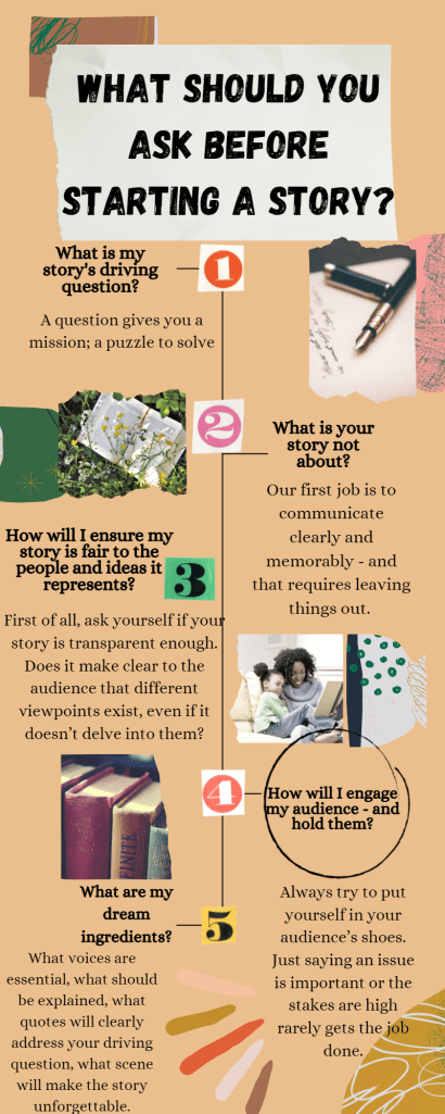
Deciding how to get a story started has always been a challenge for me but referring back to the article by NPR’s Alison MacAdam about the questions beyond the 5 w’s has been an insightful breakdown on the questions you should ask before you start writing a story.
The questions presented in my infographic are questions you should ask yourself in addition to the 5w’s: who, what, when, where, why and (a bonus, how). These questions are all fundamentals in what you should ask yourself before starting a story.
What will your audience remember when it’s over?
You can build your stories to have the impact you want them to have — by keeping in mind what you want the audience to remember and working towards it as you report, write and produce. (And yes, you should always be prepared to pivot when you learn new things in the course of your reporting.)
Alison MacAdam former Senior Editorial Specialist with the NPR Training team.
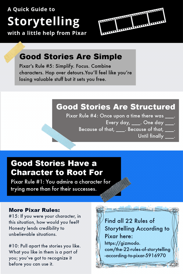
I chose to showcase three simple principles learned in EXSM3989 on how to tell a good story while also incorporating the rules from Pixar according to Cyriaque Lamar’s post that go along with these principles. As part of the 10 trends and principles of visual storytelling, I animated the graphics to add in a few “eye candies” for the reader.